/* SMILE ROOM — Web UI kit · page sections */
const { KBtn, Eyebrow, Rule, Wordmark, SectionHeading, Reveal, useParallax, useViewport } = window;

const NAV = ['Inicio', 'Tienda', 'Servicios', 'Filosofía', 'Contacto'];

const goShop = () => { const el = document.getElementById('tienda'); if (el) el.scrollIntoView({ behavior: 'smooth' }); };

const Nav = ({ active, onNav, onBook, cart }) => {
  const { isMobile } = useViewport();
  const [open, setOpen] = React.useState(false);
  React.useEffect(() => { if (!isMobile) setOpen(false); }, [isMobile]);
  const onNavClick = (n) => { onNav(n); if (n === 'Tienda') goShop(); };
  return (
  <header style={{
    position: 'sticky', top: 0, zIndex: 40, background: 'rgba(251,249,245,.86)',
    backdropFilter: 'blur(12px)', borderBottom: '1px solid var(--line-hairline)',
  }}>
    <div style={{ maxWidth: 1180, margin: '0 auto', height: isMobile ? 62 : 76, padding: isMobile ? '0 20px' : '0 32px', display: 'flex', alignItems: 'center', gap: 40 }}>
      <Wordmark size={isMobile ? 17 : 20} tagline={false} />
      {!isMobile && (
        <nav style={{ display: 'flex', gap: 30, marginLeft: 'auto' }}>
          {NAV.map(n => (
            <a key={n} onClick={() => onNavClick(n)} style={{
              fontFamily: 'var(--font-display)', fontSize: 12, fontWeight: 500,
              letterSpacing: '.14em', textTransform: 'uppercase', cursor: 'pointer',
              color: active === n ? 'var(--carbon)' : 'var(--text-muted)',
              borderBottom: active === n ? '1px solid var(--champagne-400)' : '1px solid transparent',
              paddingBottom: 4, transition: 'color var(--dur-base)',
            }}>{n}</a>
          ))}
        </nav>
      )}
      {!isMobile && <KBtn variant="gold" size="sm" icon="ph-thin ph-calendar-check" onClick={onBook}>Agendar</KBtn>}
      {!isMobile && cart && <window.CartButton cart={cart} />}
      {isMobile && (
        <div style={{ marginLeft: 'auto', display: 'flex', alignItems: 'center', gap: 4 }}>
          {cart && <window.CartButton cart={cart} />}
          <button onClick={() => setOpen(o => !o)} aria-label="Menú" style={{ background: 'none', border: 'none', cursor: 'pointer', color: 'var(--carbon)', display: 'flex', padding: 8 }}>
            <i className={open ? 'ph-thin ph-x' : 'ph-thin ph-list'} style={{ fontSize: 26 }} />
          </button>
        </div>
      )}
    </div>
    {isMobile && open && (
      <nav style={{ borderTop: '1px solid var(--line-hairline)', padding: '14px 20px 22px', display: 'flex', flexDirection: 'column', gap: 4, background: 'var(--surface-page)' }}>
        {NAV.map(n => (
          <a key={n} onClick={() => { onNavClick(n); setOpen(false); }} style={{
            fontFamily: 'var(--font-display)', fontSize: 14, fontWeight: 500, letterSpacing: '.12em',
            textTransform: 'uppercase', cursor: 'pointer', padding: '12px 4px',
            color: active === n ? 'var(--carbon)' : 'var(--text-muted)',
            borderBottom: '1px solid var(--line-hairline)',
          }}>{n}</a>
        ))}
        <div style={{ marginTop: 14 }}>
          <KBtn variant="gold" size="md" fullWidth icon="ph-thin ph-calendar-check" onClick={() => { setOpen(false); onBook(); }} style={{ width: '100%' }}>Agendar cita</KBtn>
        </div>
      </nav>
    )}
  </header>
  );
};

const Hero = ({ onBook }) => {
  const videoRef = useParallax(0.16);
  const { isMobile } = useViewport();
  return (
  <section style={{ position: 'relative', minHeight: isMobile ? 560 : 680, height: isMobile ? '88vh' : '100vh', maxHeight: 900, display: 'flex', flexDirection: 'column', justifyContent: 'flex-end', overflow: 'hidden' }}>
    <div ref={videoRef} style={{ position: 'absolute', inset: '-12% 0', zIndex: 0 }}>
      <video autoPlay muted loop playsInline poster="../../assets/photo-reception.png"
        style={{ width: '100%', height: '100%', objectFit: 'cover', animation: 'sr-kenburns 28s ease-in-out infinite alternate' }}>
        <source src="../../assets/video-smileroom.mp4" type="video/mp4" />
      </video>
    </div>
    {/* light top scrim for nav legibility */}
    <div style={{ position: 'absolute', inset: 0, zIndex: 1, background: 'linear-gradient(180deg, rgba(13,13,15,.42) 0%, rgba(13,13,15,0) 22%)' }} />
    {/* bottom scrim only — keeps most of the video clear */}
    <div style={{ position: 'absolute', inset: 0, zIndex: 1, background: 'linear-gradient(180deg, rgba(13,13,15,0) 42%, rgba(13,13,15,.34) 70%, rgba(13,13,15,.74) 100%)' }} />
    <div style={{ position: 'relative', zIndex: 2, width: '100%', padding: isMobile ? '0 22px 48px' : '0 32px 72px', display: 'flex', flexDirection: 'column', alignItems: 'center', textAlign: 'center', gap: isMobile ? 18 : 22 }}>
      <Reveal once delay={200}><Eyebrow light>Protección · Precisión · Evolución</Eyebrow></Reveal>
      <Reveal once delay={360}>
        <h1 style={{
          fontFamily: 'var(--font-display)', fontWeight: 300, letterSpacing: '.12em',
          textTransform: 'uppercase', color: 'var(--linen-50)', lineHeight: 1.14,
          margin: 0, fontSize: 'clamp(26px, 6.4vw, 52px)',
        }}>Transformamos sonrisas<br/>con <span style={{ color: 'var(--champagne-300)', fontWeight: 400 }}>excelencia</span></h1>
      </Reveal>
      <Reveal once delay={560} style={{ width: isMobile ? '100%' : 'auto' }}>
        <div style={{ display: 'flex', gap: 12, marginTop: 4, flexWrap: 'wrap', justifyContent: 'center', flexDirection: isMobile ? 'column' : 'row', alignItems: 'center' }}>
          <KBtn variant="gold" size="lg" icon="ph-thin ph-shopping-bag" onClick={goShop} style={isMobile ? { width: '100%', maxWidth: 320 } : null}>Comprar blanqueamiento</KBtn>
          <KBtn variant="light" size="lg" icon="ph-thin ph-calendar-check" onClick={onBook} style={isMobile ? { width: '100%', maxWidth: 320 } : null}>Agendar cita</KBtn>
        </div>
      </Reveal>
    </div>
  </section>
  );
};

const ServiceTile = ({ number, icon, title, desc, featured }) => (
  <div style={{
    background: 'var(--surface-card)', borderRadius: 'var(--radius-lg)',
    boxShadow: 'var(--shadow-sm), var(--ring-hairline)', padding: featured ? 38 : 28,
    display: 'flex', flexDirection: 'column', gap: 14, height: '100%',
    transition: 'all var(--dur-base) var(--ease-out)',
  }}
  onMouseEnter={e => { e.currentTarget.style.boxShadow = 'var(--shadow-lg), var(--ring-hairline)'; e.currentTarget.style.transform = 'translateY(-3px)'; }}
  onMouseLeave={e => { e.currentTarget.style.boxShadow = 'var(--shadow-sm), var(--ring-hairline)'; e.currentTarget.style.transform = 'none'; }}>
    {number && <div style={{ fontFamily: 'var(--font-display)', fontSize: 11, fontWeight: 600, letterSpacing: '.2em', color: 'var(--text-faint)' }}>{number}</div>}
    <div style={{ width: featured ? 60 : 50, height: featured ? 60 : 50, borderRadius: 'var(--radius-md)', background: 'var(--champagne-50)', color: 'var(--champagne-600)', display: 'flex', alignItems: 'center', justifyContent: 'center', marginBottom: 4 }}>
      <i className={icon} style={{ fontSize: featured ? 34 : 28, lineHeight: 0 }} />
    </div>
    <div style={{ fontFamily: 'var(--font-display)', fontWeight: 500, fontSize: featured ? 22 : 18, letterSpacing: '.05em', textTransform: 'uppercase', color: 'var(--text-strong)' }}>{title}</div>
    <p style={{ fontSize: featured ? 15 : 14, lineHeight: 1.65, color: 'var(--text-muted)', margin: 0 }}>{desc}</p>
    <div style={{ marginTop: 'auto', paddingTop: 16, display: 'flex', alignItems: 'center', gap: '.5em', color: 'var(--text-gold)', fontFamily: 'var(--font-display)', fontSize: 11, fontWeight: 600, letterSpacing: '.16em', textTransform: 'uppercase' }}>
      Conocer más <i className="ph-thin ph-arrow-right" style={{ fontSize: '1.4em' }} />
    </div>
  </div>
);

const Services = () => {
  const { isMobile, isTablet } = useViewport();
  return (
  <section style={{ padding: isMobile ? '64px 22px' : '110px 32px', maxWidth: 1180, margin: '0 auto' }}>
    <Reveal>
      <SectionHeading center rule eyebrow="Nuestros servicios" title="Odontología de Excelencia"
        subtitle="Dos especialidades insignia, ejecutadas con tecnología de vanguardia y un cuidado obsesivo por el detalle." />
    </Reveal>
    <div style={{ display: 'grid', gridTemplateColumns: isMobile ? '1fr' : '1fr 1fr', gap: isMobile ? 16 : 24, marginTop: isMobile ? 36 : 56 }}>
      <Reveal delay={0}><ServiceTile featured number="01" icon="ph-thin ph-drop" title="Limpieza de Alta Tecnología"
        desc="Profilaxis profunda y precisa con equipos de última generación. Una limpieza suave, minuciosa y profundamente efectiva que protege tu salud dental." /></Reveal>
      <Reveal delay={140}><ServiceTile featured number="02" icon="ph-thin ph-sparkle" title="Blanqueamiento POLUS"
        desc="El mejor sistema del mercado: Ultrasonido + LED + Halógena. Aclaramos tu sonrisa varios tonos en ~20 minutos, sin sensibilidad. Premiado 16 años consecutivos por Dental Advisor USA." /></Reveal>
    </div>
    <div style={{ display: 'grid', gridTemplateColumns: isMobile ? '1fr 1fr' : isTablet ? 'repeat(2,1fr)' : 'repeat(4,1fr)', gap: isMobile ? 14 : 20, marginTop: isMobile ? 16 : 24 }}>
      {[
        ['ph-thin ph-star', 'Estética', 'Diseño de sonrisa y armonía facial.'],
        ['ph-thin ph-syringe', 'Endodoncia', 'Tratamientos de conducto de precisión.'],
        ['ph-thin ph-tooth', 'Rehabilitación', 'Devolvemos forma, función y belleza.'],
        ['ph-thin ph-scan', 'Digital', 'Diagnóstico y escaneo intraoral 3D.'],
      ].map(([i, t, d], k) => (
        <Reveal key={t} delay={k * 110}><ServiceTile icon={i} title={t} desc={d} /></Reveal>
      ))}
    </div>
  </section>
  );
};

const Pillars = () => {
  const { isMobile, isTablet } = useViewport();
  const data = [
    { n: '01', i: 'ph-thin ph-target', t: 'Precisión', m: 'Cada detalle importa.' },
    { n: '02', i: 'ph-thin ph-shield-check', t: 'Protección', m: 'Cuidar antes que intervenir.' },
    { n: '03', i: 'ph-thin ph-arrows-clockwise', t: 'Evolución', m: 'La formación nunca termina.' },
    { n: '04', i: 'ph-thin ph-sparkle', t: 'Estética', m: 'La belleza nace de la armonía.' },
    { n: '05', i: 'ph-thin ph-books', t: 'Conocimiento', m: 'Estudiar cada detalle.' },
    { n: '06', i: 'ph-thin ph-arrows-counter-clockwise', t: 'Transformación', m: 'Cambiamos seguridad.' },
  ];
  return (
    <section style={{ background: 'var(--linen-100)', borderTop: '1px solid var(--line-hairline)', borderBottom: '1px solid var(--line-hairline)' }}>
      <div style={{ maxWidth: 1180, margin: '0 auto', padding: isMobile ? '60px 22px' : '90px 32px' }}>
        <Reveal><SectionHeading center eyebrow="Pilares de Smile Room" title="Lo que nos define" /></Reveal>
        <div style={{ display: 'grid', gridTemplateColumns: isMobile ? 'repeat(2,1fr)' : isTablet ? 'repeat(3,1fr)' : 'repeat(6,1fr)', gap: isMobile ? '32px 18px' : 28, marginTop: isMobile ? 40 : 52 }}>
          {data.map((p, k) => (
            <Reveal key={p.n} delay={k * 90}>
            <div style={{ display: 'flex', flexDirection: 'column', gap: 12, textAlign: 'center', alignItems: 'center' }}>
              <div style={{ fontFamily: 'var(--font-display)', fontSize: 12, fontWeight: 600, letterSpacing: '.2em', color: 'var(--champagne-500)' }}>{p.n}</div>
              <i className={p.i} style={{ fontSize: 30, color: 'var(--carbon)' }} />
              <div style={{ fontFamily: 'var(--font-display)', fontWeight: 600, fontSize: 12.5, letterSpacing: '.14em', textTransform: 'uppercase', color: 'var(--text-strong)' }}>{p.t}</div>
              <p style={{ fontSize: 12, fontStyle: 'italic', color: 'var(--text-muted)', margin: 0, lineHeight: 1.4 }}>“{p.m}”</p>
            </div>
            </Reveal>
          ))}
        </div>
      </div>
    </section>
  );
};

const Doctor = () => {
  const imgRef = useParallax(0.07);
  const { isMobile } = useViewport();
  return (
  <section style={{ maxWidth: 1180, margin: '0 auto', padding: isMobile ? '64px 22px' : '110px 32px', display: 'grid', gridTemplateColumns: isMobile ? '1fr' : '0.85fr 1fr', gap: isMobile ? 32 : 64, alignItems: 'center' }}>
    <Reveal variant="scale">
      <div style={{ borderRadius: 'var(--radius-lg)', overflow: 'hidden', boxShadow: 'var(--shadow-lg)' }}>
        <div ref={imgRef} style={{ willChange: 'transform' }}>
          <img src="../../assets/photo-coat.png" alt="Dra. Alejandra R. Rodríguez" style={{ width: '100%', display: 'block', transform: 'scale(1.2)' }} />
        </div>
      </div>
    </Reveal>
    <div style={{ display: 'flex', flexDirection: 'column', gap: 22 }}>
      <Reveal delay={120}><SectionHeading eyebrow="Nuestra filosofía" title="No cambiamos dientes. Cambiamos seguridad." /></Reveal>
      <Reveal delay={240}><p style={{ fontSize: 16, lineHeight: 1.75, color: 'var(--text-body)', margin: 0 }}>
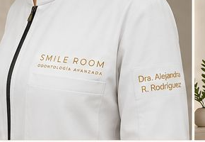
        En Smile Room estudiamos cada detalle para ofrecer odontología de excelencia. Integramos precisión, conocimiento y tecnología para transformar sonrisas con ética, arte y ciencia.
      </p></Reveal>
      <Reveal delay={360}>
        <div style={{ display: 'flex', gap: isMobile ? 26 : 40, marginTop: 8, flexWrap: 'wrap' }}>
          {[['+12', 'años de experiencia'], ['4.9★', 'satisfacción'], ['100%', 'odontología digital']].map(([a, b]) => (
            <div key={b}>
              <div style={{ fontFamily: 'var(--font-display)', fontWeight: 300, fontSize: isMobile ? 28 : 34, color: 'var(--carbon)', letterSpacing: '.02em' }}>{a}</div>
              <div style={{ fontSize: 12, color: 'var(--text-muted)', letterSpacing: '.04em', marginTop: 4 }}>{b}</div>
            </div>
          ))}
        </div>
      </Reveal>
    </div>
  </section>
  );
};

const Footer = () => {
  const { isMobile } = useViewport();
  return (
  <footer style={{ background: 'var(--carbon)', color: 'var(--linen-200)' }}>
    <div style={{ maxWidth: 1180, margin: '0 auto', padding: isMobile ? '48px 22px 32px' : '64px 32px 40px', display: 'grid', gridTemplateColumns: isMobile ? '1fr' : '1.4fr 1fr 1fr', gap: isMobile ? 32 : 48 }}>
      <div style={{ display: 'flex', flexDirection: 'column', gap: 18 }}>
        <Wordmark size={22} light />
        <p style={{ fontSize: 13, lineHeight: 1.7, color: 'rgba(255,255,255,.55)', maxWidth: '34ch' }}>Estudiamos cada detalle para transformar sonrisas con excelencia.</p>
        <div style={{ display: 'flex', gap: 16, color: 'var(--champagne-300)', fontSize: 22 }}>
          <i className="ph-thin ph-instagram-logo" /><i className="ph-thin ph-facebook-logo" /><i className="ph-thin ph-whatsapp-logo" />
        </div>
      </div>
      {[['Tienda', ['Blanqueamiento POLUS', 'Packs', 'Gel de mantenimiento', 'Cepillo Smile Room']], ['Contacto', ['smileroom.mx', '55 0000 0000', 'Lun–Sáb · 9–19h', 'Ciudad de México']]].map(([h, items]) => (
        <div key={h}>
          <div style={{ fontFamily: 'var(--font-display)', fontSize: 11, fontWeight: 600, letterSpacing: '.18em', textTransform: 'uppercase', color: 'var(--champagne-300)', marginBottom: 18 }}>{h}</div>
          <div style={{ display: 'flex', flexDirection: 'column', gap: 11 }}>
            {items.map(it => <span key={it} style={{ fontSize: 13, color: 'rgba(255,255,255,.62)' }}>{it}</span>)}
          </div>
        </div>
      ))}
    </div>
    <div style={{ borderTop: '1px solid rgba(255,255,255,.1)', padding: '20px 32px', textAlign: 'center', fontSize: 11, letterSpacing: '.1em', color: 'rgba(255,255,255,.4)' }}>
      © 2026 SMILE ROOM · ODONTOLOGÍA DIGITAL AVANZADA
    </div>
  </footer>
  );
};

Object.assign(window, { Nav, Hero, Services, Pillars, Doctor, Footer, ServiceTile });
